|
|
When we use analysis tools like Tableau software, it becomes very important to keep our bearings about the data we are investigating. For example, we need to keep in mind that Tableau retrieves and calculates information based only on the data needed to generate the graph. That statement sounds really, duh, obvious. But we can get into trouble when we don’t think about it 🙂
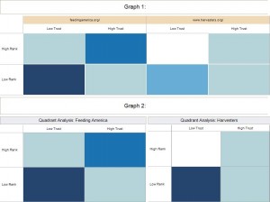
Let’s look at an example. Below are two graphs based on exactly the same underlying data – but why do the colors look different? Each graph appears to show a quadrant analysis that compares two web sites based on their search engine rank and trust.
 Graphs comparing two web sites based on their SEO rank and trust The difference lies in the way each graph is generated: the first graph really represents a set of eight data points, while the second graph represents two sets of four data points each – a subtle, but important distinction. The second graph shows the quadrants for each individual site using a separate scale for each site. This allows us to compare each site quadrant by quadrant without having to worry about one site having vastly more links than the other. In other words, we can answer questions like: which site did a better job of getting high quality links vs. low quality links?
The first graph combines the data for both sites and plots each quadrant on a scale for the combined data. If one site has many more links than the other site, it will skew the scale toward the higher linked site. In essence, we are comparing all eight quadrants against each other as opposed to comparing how each site performed on a particular quadrant.
The second graph therefore is the “correct” quadrant analysis if we want to compare each site quadrant by quadrant. But why even talk about the first graph?
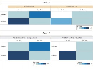
That’s because in Tableau it may be tempting to generate the first graph to save time – especially when one is new to Tableau. We only have to drag the “Site Name” dimension onto the column shelf and, voila, we can show both sites next to each other. The problem is this: the shading is now determined based on all 8 data points together – rather than using a set of 4 data points for each individual site. This becomes obvious once we add color scales to the graphs:
 Graphs comparing two web sites based on their SEO rank & trust - includes color scales The first graph really does not compare the two sites to each other. Instead it takes a look at all the links for both sites combined and creates 8 data points from all those links. The second graph uses data from one site at a time. A small – but critical – difference.
While this example may seem trivial, it actually has deep implications when we deal with more complex visualizations. For example, when we use bins or when we filter records based on certain values, we may add misleading reference lines or create inaccurate charts – but that’s a topic for another day.
Have you ever had the “pleasure” of slogging through hundreds of feedback forms from a seminar or conference? Have you ever noticed how the mind seems to dwell on the negative comments, maybe even to the point that all the positives seem to loose their luster? That’s when crunching actual survey numbers can help put things into perspective: either there really were problems or we are about to fall prey to the naysayers and constant critics.
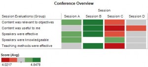
For example, this heat map makes it obvious that Session C was the least popular event in this conference – but notice also that the range of scores is fairly close together. In this example, attendees used a 5 point scale, with 1 being the least favorable score and 5 being the most favorable score. Seeing that the lowest average score was above 4 tells us that, overall, attendees were quite happy with this conference.
 A heatmap showing how each individual session was rated along multiple criteria -- click on the picture to enlarge it Of course we also want to understand what worked well and what didn’t work so well. Let us take a more detailed look at Session C.
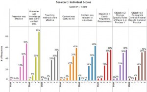
 Click the picture to enlarge it Very quickly we can tell that the audience was critical of the session content and how it was presented rather than the speaker’s knowledge about the subject. More than 90% felt that the speaker had an adequate background to present on this topic. But less than 75% were happy with the way the information was presented and how it related to their job. A few people awarded low scores of 2 and 1, but it is encouraging that these low scores came from fewer than 10% of the audience members.
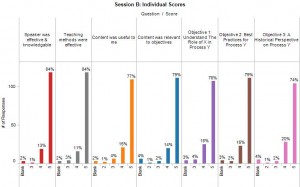
Just to provide a contrast, let’s also take a look at Session B, clearly the favorite of this event.
 Individual Scores for Session B There is no doubt that the audience rated this Session very highly across the board: 74% or more audience members awarded it the highest score across all measures. Notice that this session, too, received a handful of low scores.
As we can see here, sometimes we only need a few pictures to gain useful insights. No doubt, if this were a more involved customer survey, we would need more and very likely different graphs to discern the finer points of attitudes and perceptions — especially when such information is tracked over time. But pictures like these are a good start to find out where to focus such additional efforts.
Last week I wrote about the need to expand our visual vocabulary in line with software that allows us to graph complex data relationships and events in ever more meaningful ways. Let me expand on this point with an example.
Just about any introductory statistics course covers the draft lottery of the Vietnam War era as a case study for determining whether events occurred by chance or whether they were subject to some significant influence. Typically this case study involves a scatter plot and discussions about statistical significance, p-values and regression lines.
The section of the draft lottery we are discussing here involved the following process: Each Birthday was given a number from 1 to 366 (including leap day) so that 1 = Jan 1st, 2 = Jan 2nd, 3 = Jan 3rd and so on until 366 = Dec 31st. Each Birthday number was written on a piece of paper, put in a plastic capsule and then in a shoebox from which each was later drawn one at a time. The Draft Number represents the order in which each birthday was drawn from the shoebox.
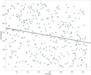
The scatter plot below shows Birthdays vs. Draft Numbers along with a trend line to indicate the relationship between the two. The casual observer may not notice the relative sparsity of data points in the upper right hand quadrant, let alone grasp the significance of it. It takes careful observation to notice that a significant number of birthdays that occur later in the year have lower draft numbers and visa versa.
 Scatter plot and trend line showing Birthday vs. Draft Number. P < 0.0001 - Click the picture to enlarge it. During business discussions or presentations we often do not have time to explain statistical models and their implications. Sometimes we need to find more intuitive means to get our point across quickly and effectively. When constructed properly, visual displays can convey a lot of information very quickly.
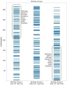
To illustrate the results from the Draft Lottery more intuitively, I divided all birthdays into three equal groups: Group 1 includes days 1 – 122, Group 2 includes days 123 to 244 and Group 3 includes days 245 to 366. I then plotted the corresponding draft numbers in each Birthday Group.
At a glance one can see that the Birthdays tend to cluster toward the upper end of the Draft Numbers range in Group 1 and toward the lower end of the Draft Numbers range in Group 3. There is no need to talk about p-values and regression lines, just a quick note pointing out that Birthdays in the early part of the year had a better chance of receiving a high draft number than Birthdays that occurred later in the year.
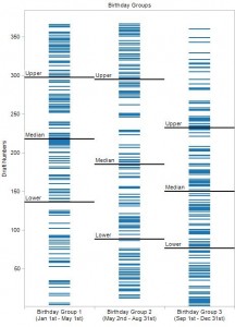
 Draft Numbers by Birthday Group. Click the picture to enlarge it. An alternative representation may include reference lines for quartiles as in this illustration:
 Draft Numbers by Birthday Group - including reference lines for quartiles. Click the picture to enlarge it. Business decisions, of course, are based on more than fancy pictures and we need to be able to back things up through detailed analysis. But when time is short and we need to make our point quickly, the second graph helps us out much more than the scatter plot.
Acknowledgements:
A big “Thank You” goes to the authors of “Online Statistics: An Interactive Multimedia Course of Study” for providing the data and for the inspiration to visualize it in a format other than a scatter plot. This free online course was developed at Rice University, University of Houston, Clear Lake, and University of Houston, Downtown, with partial support from the National Science Foundation.
All graphs were generated using Tableau software.
During several conversations recently the following comment came up: “What’s the big deal with visual analytics? It’s just a bunch of pretty pictures!” It took a while, but it finally dawned on me that we have reached the Xerox-GUI-Macintosh stage for data analysis. The early versions of a graphical user interface (GUI) which were developed at what was then called Xerox-PARC were no commercial success until Macintosh – now better known as Apple – created a computer that allowed everyone to point and click rather than write arcane computer instructions.
While point-and-click is much easier than writing code, it still requires computer users to become familiar with what the computer can do and how to accomplish various tasks. It also requires standards about where to click and what should happen when certain actions are taken. All this knowledge and these standards had to develop over time and often through trial and error.
In some ways we have reached a similar stage for data analysis: visual analytics provides a new language through which non-analysts can explore and answer business questions. It frees the non-technical user from the analytic equivalent of writing code, that is, it frees them from the need to learn how to create graphics that – until now – required significant technical knowledge to generate.
As with any new technology, some mayhem ensues: we have to gain experience and learn through practice. We need to become fluent in the appropriate use of less familiar – yet oddly intuitive – graphing techniques like sparklines, heatmaps or small multiples. In short, we must develop a visual vocabulary beyond the bar charts and line graphs we know from Excel or PowerPoint.
And this brings me back to the Xerox-GUI-Macintosh comment from the beginning: as in those early days of learning the language of icons and point-and-click, we have now reached the point where more powerful ways of encoding data in a visual format is available to the lay person. Just as with the graphical user interface, we will some day look back and say “I can’t imagine a world without seeing data in pictures.” For at least a little while, those of us in the analyst professions need to act as interpreters and guides to those who are learning this new language. Sooner rather than later we will all get there.
For several years I have participated in the Heartland Association of Research Professionals (HARP), a non-profit organization that provides educational and networking opportunities for nearly 200 professionals engaged in clinical research and related fields.
Recently we surveyed current and prospective HARP members to gather feedback regarding the services we provide. This gave me a nice opportunity to learn more about Tableau. While I did encounter some formatting issues, Tableau provided a quick and easy way to explore survey results.
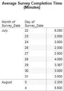
Quite useful was the ability to set up all the graphs, tables and dashboards while the survey data was being collected. Periodically I could update everything simply by refreshing the underlying data. This allowed me to easily keep my fellow board members in the loop while data was rolling in. It also allowed me to send reminders to survey participants using actual completion times to assure them that participation would really take only take a few minutes of their time.

Questions that allow for multiple answers can be a bit tricky to analyze, but visualizing the results with Tableau made that analysis much easier. The example here illustrates the various research certifications held by HARP members. This question focused on research certification as opposed to certification in other domains.

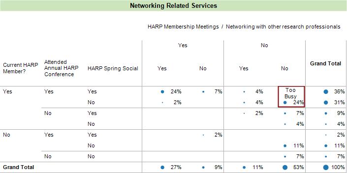
Below is an example using graphical clues and annotation to illustrate which of four networking related services were used by current and prospective HARP members. I cannot imagine anyone who would want to read a written description of these results. A picture communicates this much better and without the proverbial “thousand words.”

To improve readability, Tableau provides a great variety of formatting and labeling options such as turning titles, column and row headings on or off.
Example 1: Title turned on, Row Headings turned off:

Example 2: Title turned off, Row Headings turned on:

From a communications standpoint, it would have been nice if there had been a way to include all options of the five point scale in this graph. The fact that no one selected “Somewhat Unimportant” nor “Unimportant” would be much easier to see if I did not have to talk about it in a comment.
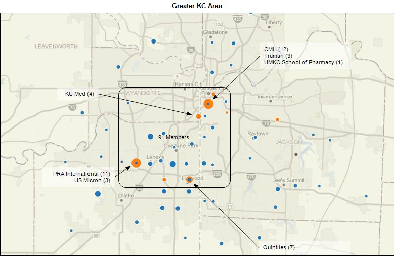
Using nothing more than zip codes as geographic coding data, Tableau provided us with a quick idea about the geographic dispersion of our membership – very handy, since picking a good meeting location is always a tricky topic.

With the Public Option now officially in doubt, suggestions regarding health care co-operatives are becoming talking points again. Critics point out that we already have health care cooperatives that have done very little to lower health care costs. Proponents point to success stories about how co-operative arrangements lead to better health care.
In theory, co-ops offer many positive qualities. Market forces rather than governmental agencies determine services and payment levels. There is an incentive for health care providers to work efficiently and effectively since “profits” are re-invested into the co-op. Proponents also see co-ops as a competitive alternative to established insurance providers. By making patients part owners, patients theoretically become more interested in making appropriate health care and life style choices in order to keep costs down.
Implementing and managing co-ops is another matter. Many different – and sometimes contradictory – goals are in play: businesses and investors need to make money, patients want choice and excellent healthcare, government – or rather, taxpayers – cannot continue footing the bill for escalating health care costs. In essence, co-ops are just delaying the health care debate and pushing it further down the ranks rather than tackling the thorny issues at a national level. Just providing seed money from Washington does not help with addressing these issues.
I don’t know anyone who doesn’t think that our current system is broken and that we need to do “something.” For better or for worse, we live in a society in which money and profit play a key role when it comes to allocating health care resources. We need to find incentives that fairly balance contradictory needs and encourage responsible behavior by everyone – from patient to provider to business to government.
Unfortunately for health care reform, responsible behavior is very subjective and very much influenced by one’s philosophical and spiritual way of thinking. Hence the problem: what appears as good and prudent medical care to me may appear wasteful or gold plated to someone else. Using different words to say the same thing: what appears as irresponsible, greedy or callous behavior to some is viewed as prudent business and appropriate health care by others.
To my way of thinking, the ideal solution lies in finding ways in which patients and doctors can discuss appropriate approaches to health care on an individual basis. This means paying doctors for consulting with patients and not just for administering procedures. It also means that patients need to take responsibility for their health. Healthcare ultimately is a deeply personal experience, subject to many factors that cannot be legislated. Socio-economic, lifestyle, philosophical and spiritual issues need to be taken into consideration as necessary.
This does not mean that society is required to pay for everything – but creating an environment in which everyone receives support when facing a devastating calamity is a worthwhile undertaking. Health outcomes research along with frank discussions about quality of life and the value of extending life for a few weeks are necessary and we should not let ourselves be swayed by those who use these topics to sow fear.
All this is a long way of saying: the idea of health care co-ops sounds appealing because in theory they allow for individual patient-doctor discussions and thus informed decision making. Given their track record and the huge hurdle to entering the market place, the skeptic in me believes that they will just muddle the water without solving our health care crisis.
Additional Reading
Neither Quick Nor Easy
By THOMAS L. GREANEY
August 18, 2009
http://www.thehealthcareblog.com/the_health_care_blog/2009/08/neither-quick-nor-easy.html
Health Care Cooperatives–An Old New Idea–So What’s a Blue Cross Plan?
Health Care Policy and Marketplace Review
June 12, 2009
http://healthpolicyandmarket.blogspot.com/2009/06/health-care-cooperatives-old-new-idea.html
Health Co-op Offers Model for Overhaul
New York Times
July 6, 2009
http://www.nytimes.com/2009/07/07/health/policy/07coop.html?_r=1&ref=us
Co-Ops Are the Single Dumbest Idea I Have Heard in the Health Care Debate in Twenty Years
Health Care Policy and Marketplace Review
August 17, 2009
http://healthpolicyandmarket.blogspot.com/2009/08/co-ops-are-single-dumbest-idea-i-have.html
Seattle-area Health Co-Op Offers Alternative Health System Model
Kaiser Health News
Jul 07, 2009
http://www.kaiserhealthnews.org/Daily-Reports/2009/July/07/Seattle.aspx?referrer=search
Weighty Choices, in Patients’ Hands
The Wall Street Journal
AUGUST 4, 2009
http://online.wsj.com/article/SB10001424052970203674704574328570637446770.html
Administration Could Find Compromise in Co-op Plan
Kaiser Health News
Jun 15, 2009
http://www.kaiserhealthnews.org/Daily-Reports/2009/June/15/compromise-coops.aspx?referrer=search
Tennessee Experiment’s High Cost Fuels Health-Care Debate
Wall Street Journal
AUGUST 17, 2009
http://online.wsj.com/article/SB125046457087135327.html
Cost and Coverage Impacts of the American Affordable Health Choices Act
of 2009: The July 15th draft
The Lewin Group
July 27, 2009
http://www.lewin.com/content/publications/LewinAnalysisHouseBill2009.pdf
Summary of House Health Care Reform Bill –
America’s Affordable Health Choices Act
Sustainable Middle Class
July 18th, 2009
http://blog.sustainablemiddleclass.com/?p=1383
Co-Op Option Offers Compromise In Health Debate
NPR
June 30, 2009
http://www.npr.org/templates/story/story.php?storyId=105957689
Health co-ops have checkered history
by The Associated Press
WASHINGTON August 18, 2009, 03:05 am ET
http://www.npr.org/templates/story/story.php?storyId=111967966
What Health Care Co-Ops Might Look Like
NPR
August 17, 2009
http://www.npr.org/templates/story/story.php?storyId=111959363
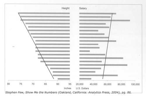
An illustration by visual analytics guru Stephen Few recently caught my eye because it seems to run counter to the excellent advice he usually provides. In his 2004 book “Show Me the Numbers” he suggests the use of paired bar graphs as an alternative to scatter plots when the intended audience is unfamiliar with such graphs. What got my attention was the way in which the example graph was constructed:
- the scales on both bar charts did not start at zero
- both charts included a trend line despite differing scales.

To the casual reader this leaves the unfortunate impression that one can ignore scales and starting points when creating paired bar graphs. In this case one bar chart displays heights measured in increments of 15 inches while the other shows US Dollars measured in increments of $20,000. Neither bar graph starts at zero.
To be fair, the discussion at this point in the book revolves around different ways of indicating whether a correlation between two variables exists – in other words, whether a change in one variable relates to a predictable change in the second variable. Stephen Few suggests that looking at the overall direction of the trend lines and how the individual bars relate to each other is more important than their slopes and bar size when it comes to looking for a possible correlation.
This subtle point may be missed by many readers. When we see multiple trend lines in a graph, we automatically compare them and implicitly look at their slopes to determine how much they differ from each other. A casual reader may even use the trend lines to infer how strong the correlation is, when their slope, in fact, depends on the aspect ratio of the graph rather than the correlation between the two variables.
The scales for the relevant axis have to match when placing graphs next to each other for comparison. That is tricky when dealing with different measures, especially when they have very different scales (inches vs dollars). By the same token, bars should start at zero or else the differences between them will be exaggerated.
While this example makes sense as a quick illustration of the concept being discussed in the book, it would be better not to use a similarly constructed paired bar graph as part of a presentation because it can so easily be manipulated and misunderstood.
Today the Wall Street Journal and the Twitterverse are buzzing about Wal-Mart coming out in favor of an employer mandate on health insurance. This news interests me on several levels. Leaving aside the cynical observation that Wal-Mart is simply seeking to avoid more onerous legislation, this news raises several questions, including the following:
- As the largest private employer, Wal-Mart has the kind of clout that no other private US employer has: 1.4 million employees is a large pool over which to spread risk. It would be interesting to know to what extend this pool includes young and healthy employees vs. older employees with more extensive healthcare needs. It may also be interesting to know to what extent Wal-Mart employees fit the stereotypical health profile of low wage earners. According to a Wal-Mart sourced graph in the WSJ, only 52% of its employees get their insurance through Wal-Mart. This begs the question “why do the other 48% go elsewhere?” Does it have to do with coverage being better elsewhere? This is a real question – I am not trying to imply anything here.
- With roughly 700,000 lives to cover (50% of 1.4 million), Wal-Mart can offer some efficiencies to insurers that they would not have if all these policies had to be managed within the Individual Market: one standard policy for hundreds of thousands of people, without the need for an underwriter to talk to each one of them. Does this make an argument in favor of “single payor” and “coverage for everyone?” After all, the law of large numbers implies that the bigger the pool, the more likely we can determine the “true average” of medical costs.
- Given its size, Wal-Mart is in a unique position to negotiate price breaks – whether they are for insurance coverage or employee health services (think preventive screening, health education, etc.). Small businesses can’t keep up with that, yet they employ the majority of employees in this country and are at greater risk for increased healthcare costs due to their smaller “pool” of employees. If small companies are eventually exempted from a mandate, what have we really gained by requiring employers to pay for health insurance?
Philosophical Meanderings
The crux of our healthcare debate lies in the fact that we have a very desirable product, but not enough resources to provide the full extent of this product to everyone. Doctors have the knowledge and expertise to cure many more diseases and they can extend the lives of many more patients than in the past. That comes at a cost. By default we are currently rationing access to this product based on who has access to health insurance or who can pay for it through other means. There has to be a better way.
So, what can we do? First of all, let’s cut through the rhetoric of ideology and political posturing. As with so many things in life, the real answer falls somewhere between “market forces” and “socialized medicine.” Everyone needs to give a little and everyone needs to take a little more responsibility. By “everyone” I truly mean everybody – because to some extent we are all involved in this debate, regardless of whether we are a taxpayer, patient, provider, insurer or someone engaged in the many industries that support or deal with health care.
Many of us have already started down this path. I notice more and more discussion about appropriate end-of-life care, whether the expense of a treatment is justified by the expected outcome, whether it is necessary to see a doctor for a particular ailment, how individuals can make healthier life style choices, what role primary care doctors should play in healthcare, and on and on. Some examples that have recently caught my attention can be found in the “Additional Reading” section at the end.
Looking at all these discussions it seems that the “market forces” are grappling with the “socialized medicine forces” to come up with a blended solution. That sounds like a promising deal to me – as long as we actually get there.
Additional Reading
Quality of Death: End of Life Care in America
WBUR
Posted by CommonHealth
Sunday, April 26th, 2009
http://commonhealth.wbur.org/wbur-posts-and-stories/2009/04/quality-of-death-end-of-life-care-in-america/
Candidates Aplenty for Spending on Comparative Effectiveness
June 30, 2009, 4:04 PM ET
WSJ Health Blog
http://blogs.wsj.com/health/2009/06/30/candidates-aplenty-for-fed-spending-on-comparative-effectiveness/
An Open Letter to Dr. David Blumenthal
By RICK WEINHAUS, MD
June 26, 2009
The Health Care Blog
http://www.thehealthcareblog.com/the_health_care_blog/2009/06/an-open-letter-to-dr-david-blumenthal.html#more
an article pleading for more user-friendly EHR software (EHR: electronic healthcare record) and related discussion
One Reporter’s Painful Decision
by Richard Knox
June 15, 2009
NPR Health Blog
http://www.npr.org/blogs/health/2009/06/by_richard_knox_i_broke.html – deciding when (not) to see a doctor
Advance Directives, Living Wills, and End-of-Life Issues
Up to Date
KCUR Radio
April 16, 2009
Podcast Link: http://archive.kcur.org/kcurViewDirect.asp?PlayListID=6484
Link Source: http://www.practicalbioethics.org/cpb.aspx?pgID=1080
“Guest host Stephen Steigman talks with Center for Practical Bioethics senior fellow Bill Colby and Dr. Karin Porter-Williamson, an assistant professor, section head and Medical Director for Palliative Care services at the KU Medical Center about advance directives and living wills: what we need to have ready, who needs to know it and how to ensure our wishes and those of our loved ones are carried out.”
Ever since attending a data mining workshop in the late 1990’s I wondered how soon software would evolve to the point where someone could draw meaningful conclusions from data without needing a Ph.D. in statistics or extensive database and query tool experience. It now appears that we have crossed the frontier into this new era of informed decision making.
Software companies like Tibco/Spotfire and Tableau are putting visual analytics front and center when it comes to helping businesses find out where their bottom line hurts and where opportunities may be hiding. A recent article by Ted Cuzzillo for The Data Warehousing InstituteTM talks about a “new breed of BI Analyst” who wants to dive into the data, try things out, see what works and explore it in an interactive, almost intuitive, manner. Enterprise blogger Michael Vizard, who writes for the Ziff Davis suite of publications, even foresees “The Demise of Report Writers and Spreadsheet Jockeys.”
Too good to be true?
Remember the promise of the “E.I.S.”, the Executive Information System, which was supposed to put all the answers at the fingertips of executives and management? Once the novelty wore off, executives and managers asked their administrative staff to pull data and print out reports from their company’s E.I.S. When questions arose, the IT or Business Information departments still needed to provide answers.
I don’t mean to rain on anyone’s parade: visual analytics is the future and I enjoy using tools such as Tableau (see my review here). Visual exploration opens the door to much faster insight and understanding of what’s happening in a business. Rather, this is meant as a cautionary note not to get caught up in the belief that a tool alone can solve our information problems and turn someone into an expert analyst with all the correct answers. The risk with visual analytics lies in the fact that it appears to turn data analysis into child’s play, when, in fact, real work has to be done.
Tackling the hidden hazards of visual analytics
Let’s face it: to draw useful conclusions one has to deal with the fact that data is imperfect, that factors beyond our control affect the quality of data and that sometimes good judgment is needed to discern the meaningful from inconsequential.
An analyst has to understand the data behind each graph and know how it is collected, processed and presented. When is data updated? Why could data be missing or incorrect? When is an unusual observation due to problems with the underlying data rather than actual performance of the business? These are just some of the factors that may influence the outcome of an analysis, visual or not.
Granted, if the underlying data tables are well designed and if good data quality processes are in place, visual analysis becomes much safer for someone who doesn’t have time to worry about data schemas, update cycles and data scrubbing. None the less, the person performing the analysis still has to know how to question the underlying data or risk reaching misinformed conclusions.
Visualization tools often make it easy to group data and to create new summaries on the fly. Discerning what really drives results can be tricky when dealing with such summaries and groupings. For instance, when drugs are used to treat multiple indications, how do we know that the data group we are exploring really contains all the relevant elements? There’s something to be said for good meta data management and clear definitions for the metrics used by decision makers.
Graphs and charts are simply clutter unless one has the good judgment of knowing which blips are worth exploring and which are simply noise. Some outliers point to real issues while others are merely distortions. Knowing which is which requires business knowledge and a feel for how data behaves. For instance, a spike in unit sales has very different implications for the bottom line when high unit sales are achieved through heavy discounting for major customers as opposed to gaining new customers at full price.
Visual analytics is no longer the next frontier
The emergence of visual analytics feels a little bit like going from command line DOS to the visual interface of Windows. The further away we get from knowing about the inner workings of a computer – or in this case “the data” – the easier it becomes for errors to slip past our awareness because we don’t know what questions to ask or what can get us into trouble. Just ask any computer security expert how often people neglect to install or maintain intrusion protections on their computers. Yet, nowadays no one can imagine life without computers anymore.
Today’s abilities to easily pull information together from various sources, to create graphs on the fly and to select individual data points for further analysis would be impossible without the ability to remove ourselves from the tedious details of collecting, transforming, staging and retrieving data. Without the ability to gain distance from the inner workings of data we would drown in information overload – which really is no better than having to run a business by gut feeling and dead reckoning.
The real power of visual analytics comes to the fore because an analyst now has the tools to combine business knowledge and data expertise without having to spend hours preparing code or staging data in more effective ways. That time can now be spent doing analysis and deriving value from the data.
However, with power comes responsibility. Just because today’s tools remove us from the tedium of data preparation doesn’t mean we abdicate our responsibility for analyzing what’s under the hood. Instead, we have to develop QC methods and standards that allow us to recognize when something goes awry.
Personally, I am happy to see that business intelligence applications and visualization are merging together. Point and click frees my inner data geek from having to write tons of code and allows me to get right to the fun part: seeing what I’m dealing with, understanding how the pieces fit together and figuring out answers. Now I’m just waiting for the day when we can say “Computer, tell me how to answer this question!” That’s the day I get to retire 🙂
Recently I have been playing with the Personal edition of Tableau Software, and decided to add it to my suite of analytical tools. Tableau, which sounds like [TAB – low], is the French word for “picture” or “drawing” and the Tableau software does just that: it provides an easy way to explore data visually and suggests best practices for displaying the data at hand. For us data geeks out there, it’s also noteworthy that the phrase “tableau de bord” means dashboard in French.
On June 2nd, Tableau released Version 5.0 of its desktop and server software products, which include numerous new features to better draw out important information, to explore large data sets and to analyze data simultaneously across multiple sources. This new release is just one more example that visual analytics no longer is the new frontier, it is the new *reality*.
(See: Visual Analytics: Breaching the New Frontier in Business Analysis)
As with all powerful analysis tools, using Tableau from scratch can be daunting for the uninitiated. However, it provides so many ways of guiding users to success, that a novice can quickly gain proficiency without first attending days worth of user training classes. To stay with the metaphor: Tableau software provides the equivalent of paint by numbers. There are some rules to follow and it’s possible to slip up and draw outside the lines, but the guidance is there if one chooses to use it.
To serve business leaders who prefer to see “just the facts” and let someone else go data diving, Tableau provides powerful authoring tools that allow an analyst to guide the reader to the important insights while still giving the reader the ability to explore data from different angles. Depending on the need, results can be packaged as stand-alone presentations for ad-hoc kinds of analysis or be connected to data stores for continuous updates and performance tracking.
Here are some of my Tableau favorites
(not all of them new and in no particular order)
- explore outliers simply by highlighting their data points
- the summary panel, which aggregates selected data points on the fly
- highlight the same data points across multiple, linked graphs
- highlight important data with color while graying out the rest
- the many self-documenting features
- the automatic re-sizing of graphs depending on what else is on the screen
- the worksheet metaphor
- cloning worksheets
- customize user prompts for filters and other data controls
- hide confidential details by distributing aggregate data only
- on the fly grouping and data aggregation
By no means is this an exhaustive list, but these are just some of the ways in which Tableau makes data exploration more effective and easier to accomplish.
Some Tableau growing pains
Before this post sounds like a PR piece, let me mention a few minor points that worked out less well.
The Personal Edition supports database connections to text files, Excel and MS Access. Just to see what would happen, I used a very large table in MS Access and found that Tableau was slower than using Excel Pivot tables against the same table. Not many desktop users would attempt using a million row table in Access and MS Access is no speed demon either when it comes to serving up data for Tableau. Using a much smaller table with less than 100,000 rows worked like a charm.
Working with large tables can be made more efficient with a feature that allows the user to suspend table queries until all the query criteria have been set up. Good if you already know how to structure the graph, less useful if you’re trying to explore the underlying data.
For some types of analysis I like to color code states based on my own data but I could not find a way to do so. The Tableau folks are very concerned about proper data visualization techniques and thus worry about coloring states based on data, lest the geographic size of a state distorts the viewer’s interpretation of the data. On the other hand, they do provide the ability to color states based on census data that is preloaded and ready to use. Maybe there is a Jedi technique for shading states based on my own data, but so far I have not found it.
All in all, though, I have been very impressed with the rich feature set that Tableau provides and have started using it for data exploration.
Additional Reading
Thank you to Michael Cristiani (twitter.com/mcristia) and Daniel Murray (twitter.com/DGM885) for recommending the following:
“Freakalytics.com- Home” http://bit.ly/W8KwE
Blog: “#Tableau 5.0 Active Dashboards and Enterprise Scalability” http://is.gd/MEyr and http://is.gd/MEBc
Server videos on the Tableau web site: http://www.tableausoftware.com/learning/training/ondemand
Tableau 5.0 Whitepaper -> Stolte, Chris. “Enhanced Visual Analysis by Linking Multiple Views of Data”: http://is.gd/MEt0
“Seems to be PRish, but some real good info about the Server 5.0 there: http://is.gd/PB8x”
|
|

