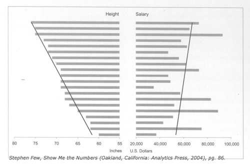
An illustration by visual analytics guru Stephen Few recently caught my eye because it seems to run counter to the excellent advice he usually provides. In his 2004 book “Show Me the Numbers” he suggests the use of paired bar graphs as an alternative to scatter plots when the intended audience is unfamiliar with such graphs. What got my attention was the way in which the example graph was constructed:
- the scales on both bar charts did not start at zero
- both charts included a trend line despite differing scales.

To the casual reader this leaves the unfortunate impression that one can ignore scales and starting points when creating paired bar graphs. In this case one bar chart displays heights measured in increments of 15 inches while the other shows US Dollars measured in increments of $20,000. Neither bar graph starts at zero.
To be fair, the discussion at this point in the book revolves around different ways of indicating whether a correlation between two variables exists – in other words, whether a change in one variable relates to a predictable change in the second variable. Stephen Few suggests that looking at the overall direction of the trend lines and how the individual bars relate to each other is more important than their slopes and bar size when it comes to looking for a possible correlation.
This subtle point may be missed by many readers. When we see multiple trend lines in a graph, we automatically compare them and implicitly look at their slopes to determine how much they differ from each other. A casual reader may even use the trend lines to infer how strong the correlation is, when their slope, in fact, depends on the aspect ratio of the graph rather than the correlation between the two variables.
The scales for the relevant axis have to match when placing graphs next to each other for comparison. That is tricky when dealing with different measures, especially when they have very different scales (inches vs dollars). By the same token, bars should start at zero or else the differences between them will be exaggerated.
While this example makes sense as a quick illustration of the concept being discussed in the book, it would be better not to use a similarly constructed paired bar graph as part of a presentation because it can so easily be manipulated and misunderstood.

WOW!