I have to admit that even after reading Stephen Few’s article on dual axis graphs, I am not quite ready to rule them out entirely. As is so often the case with data visualization, what we use depends on what we’re trying to do. I agree with Joe Mako and Stephen Few that, when used as a communication tool, dual axis graphs often confuse rather than communicate. Therefore it makes little sense to use them in dashboards and other situations where we need to communicate information quickly and at a glance.
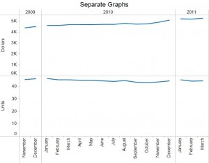
But I do find dual axis graphs useful as a shortcut when exploring data – precisely because I can more clearly see the shape of the two curves in relation to each other. Below is an example that looks at Dollars and Units. When graphing them separately, the lines look somewhat similar and it takes a second look to notice that Units are declining while Dollars are increasing.
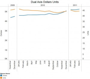
In the dual axis graph below, I got that message without needing a second look:
When exploring data with visual analytics tools like Tableau, a dual axis graph can help me compare metrics quickly to see whether something jumps out. Are the curves moving in synch with each other? Are they trending in a similar direction? Do the curves indicate anything useful from a business point of view? For instance, in this example it looks like our margin might be improving. If the curves moved in the opposite direction, we may need to ask whether we’re discounting too much.
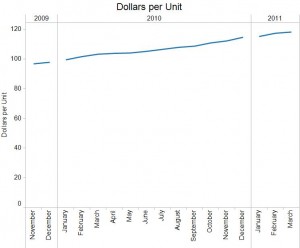
As Joe Mako and Stephen Few point out, in a dual axis graph we cannot compare the magnitude of change, but we can get a general feel for the direction and whether there are further questions we need to ask. In this example, a simple ratio calculation of Dollars per Unit helps to confirm whether we’re onto something. When we report results from our analysis, a graph of this ratio will do a better job showing the relationship between Dollars and Units than the dual axis graph shown above.


Thanks, Joe, those are excellent suggestions 🙂
I would also add that the visualization should be built to answer the question. If the goal is to determine if the counts or amount is increasing or decreasing, and not so much what the exact count/amount is, then looking at percent difference creates a common scale that provides a valid comparison so you can see the rate of increase charted instead of just comparing the slope of the lines. Another option when the values you want to compare are very different (10s vs 1000s) is a logarithmic scale. Stephen Few’s book “Now You See It”: http://www.perceptualedge.com/library.php covers additional alternatives to quantitatively display values in situations like these and keep the visual representation of the data accurate so you can come to correct conclusions. I believe dual axis charts with different scales mislead more than they help because they add visually interesting features that should not be paid attention to (like when the lines cross).