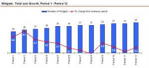
Many charting tools allow us to combine bar charts and line graphs in the same graphic – but should we? This question came up when I did a double take the other day while reading a market research report. In order to focus on function rather than content, I have re-created a similar graph below:
If the author’s intent was to induce a double take, it worked for me – in a confusing sort of way:
- It caught my eye that the line graph is trending down while the bars are going up
- But it took a few moments to realize what the line graph actually represents
- And it took a few more moments to realize the message behind the graph: Widget volume is going up, but the rate of growth has turned from “healthy” to “anemic”
That was way too much work to get the gist of this graph! Why was this so difficult to get?
Instead of providing a scale, the individual data points are labeled – this clutters up the picture and distracts the eye. Not only that, it is difficult to get a ballpark idea for the maximum values unless one scans each data point – a scale for each data series would have provided that contextual information much more quickly.
When I re-created the graph I realized something else: in order to display the line graph within the colored bars, I had to set the maximum value for the percentage scale higher than what would be expected: instead of setting the top percentage value to 10% I had to use 15% to push the line graph down far enough to completely overlap with the bars.
Also, fewer words in the legend labels would have been better (the original had even more text!) – and it would have helped to spell out the word “percent” instead of hiding the percent symbol amongst all that text. Better yet: be consistent and stick with the same nomenclature: the chart title says “Volume and Growth” so the series labels should say the same.
Maybe this is a nit pick, but I prefer legends at the bottom or the side of a graph. The top should be reserved for the title – IMHO.
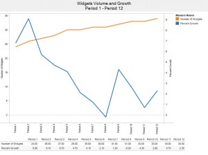
Finally, the question of whether we should mix bar charts with line graphs: I don’t think so. The bars overpower the picture and clutter things up. Call me a minimalist, but it’s much easier to see how volume and rate of growth relate to each other when we draw two clean lines like so:
With less clutter, the eye can very quickly take in the overall picture and focus on what matters:
- Number of Widgets is going up,
- Percent Growth is going down.
If the data values really matter to us, we can look them up in the table below the graph.


Joe,
I have to admit that even after reading Stephen Few’s article, I am not quite ready to rule out dual axis graphs entirely. As is so often the case with data visualization, whether we use it depends on what we’re trying to do. Here’s a post with additional thoughts …
Joe,
as always, you make an excellent point – and it made me chuckle at myself for not catching that point when I wrote the post. Thanks for sharing the links.
The main thing I do not like about dual axis charts that use different scales is when the lines cross, I have to remember that that point or crossing is meaningless, and trying to compare the magnitude of the lines to each other can also be misleading.
If you goal is to show both an increase in count over time, but a small percent difference between each, then a dual axis of percent difference from first along with percent difference from previous would make more sense in my opinion. And if you wanted to see the detail of one, you could put them on separate axes.
Here is an example: http://public.tableausoftware.com/views/percentdifferencedualaxis/Both
I would also recommend checking out Stephen Few’s thoughts on what happens when you use a dual axis: http://www.perceptualedge.com/articles/visual_business_intelligence/dual-scaled_axes.pdf