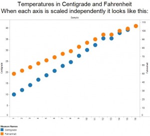
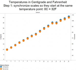
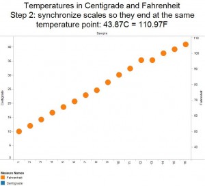
This quick follow-up on dual axis graphs shows another take on their potential use. The first suggestion comes from Naomi Robbins in her book “Creating More Effective Graphs.” 1 She suggests that dual axis graphs may be useful to represent data in different – but equivalent – measurement units such as Centigrade (Celsius) and Fahrenheit. Some of us can understand temperature better when it is expressed in Fahrenheit, while others relate better to temperatures on a Celsius scale. This example works because we are graphing the same thing, we’re just expressing it in different units and provide the two scales as an easy reference.
When doing this, however, we have to ensure that both scales are synched up as illustrated below.
The other example comes from Dona Wong’s recent Wall Street Journal. Guide to Information Graphics. 2 In it she suggests using dual axis graphs to “ … help show how two directly related series move together.” The picture below – courtesy of Kaiser Fung’s Junk Charts blog – shows the example from her book. 3
I am somewhat ambivalent about this chart since we have to be careful in selecting each scale in order avoid distorting the data (note that the Market Share scale starts at 30% and that the increments for both scales line up).
When done properly, both examples help us when we need to make a point with a single picture: we can save space and keep two related pieces of information within easy view. This works best when illustrating a specific issue and when we can use a static picture in a newspaper, printed report or a presentation. We’re asking for trouble when using this approach in a dynamic environment, like a dashboard, where scales need to adapt to the latest data.
Acknowledgements:
1. Naomi B. Robbins, Creating More Effective Graphs (New Jersey: John Wiley & Sons, Inc., 2005), page 262
2. Dona M. Wong, The Wall Street Journal. Guide to Information Graphics (New York: W.W. Norton & Company, Inc.), page 59
3. Reading: WSJ Guide to Information Graphics, Posted on Mar 06, 2010 at 02:59 PM, Junk Charts: Infographics


