The term “dashboard” provides a convenient metaphor because everyone has at least some idea of what a dashboard looks like – and therein lies the problem: our own idea of a dashboard may differ wildly from someone else’s idea of a dashboard. When people talk about dashboards, there may be a huge communications gap and it pays to build a bridge across that gap before taking any action toward developing a dashboard.
| There’s a big difference between the dashboard of a car and that of a passenger jet! For one thing, understanding a car dashboard requires significantly less training and experience than a cockpit dashboard. Of course each is designed to meet different needs: a pilot has to worry about many more things than a car driver when ferrying passengers safely from Point A to Point B.
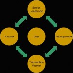
When developing information dashboards for a business we also need to keep user needs in mind: a VP of Marketing will need a much more high-level overview than a Product Director, who in turn has quite different requirements from a sales rep preparing an action plan. In practical terms this means that we first have to figure out who will use the dashboard and how. |
Image credit: http://flysusan.com/cockpits.htm |
| A dashboard is only useful when it can become an integral part of decision making. Some decisions need to be made on a daily basis, such as which prospects to call or how to follow-up with a client. Other decisions take more time. Those decisions tend to be more organizational and strategic in nature. They require input from many people and data sources, they require observation and a longer term perspective.
The implication here is that a dashboard needs to be capable of providing information at the speed with which decisions are made. A dashboard also needs to provide the appropriate amount of summary and detail. Before we can build anything, we need to define what information is actionable and how soon it needs to be available. |
 |
From a technical standpoint, this initial exploration provides the framework for determining how the dashboard should be build. The following questions are just a starting point:
- What information is required?
- How will the information be used?
- What kinds of summaries and calculations make the most sense?
- How much detail should be included?
- How can we best present the information?
- How often does data need to be refreshed?
- Which databases and information sources are necessary?
- Which software/hardware best meets our needs?
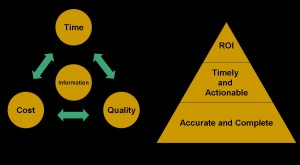
The answers to these questions always involve tradeoffs. Which tradeoffs make sense depends on the impact the dashboard will have and whether we can demonstrate a positive ROI. At some point, the dashboard has to help improve the bottom line.
Drawing a direct line between dashboard and bottom line dollars can be complicated. Dashboard benefits tend to be intangible. To measure ROI, we have to think about how the dashboard enables better decisions, how it helps users focus on profitable actions and whether it helps to save time or other resources. Often we need to offset these intangible benefits against very real budgets and real money that needs to be spent on development, training, software, hardware, and so on.
As we can see, if we are serious about building a dashboard, we also have to be serious about spending some time upfront to map out a plan for getting from the Basic Idea to an Actual Dashboard. To get there, everyone involved needs to develop a common language, that is, a set of common definitions and goals. For instance, if our dashboard is supposed to track progress following a product launch we need a common understanding of what market penetration means. Does it mean “number of actual customers vs. potential customers” or “number of actual customers vs. number of targets” or “number of customers who bought at least X number of widgets.” How we define our key metrics has a direct impact on the usefulness of our dashboard and on the effort required to build it.
Developing common definitions and goals is a key step toward building a bridge across the communication gap. Just because we are using terminology that seems to be well defined doesn’t mean we really are talking about the same thing. For example, we might be talking about lighthouses and we might even have the same general idea of what a light house is and how a typical lighthouse looks. But when it comes to actually building the lighthouse we need something more concrete.
What’s a lighthouse?
Image credits (L to R):
http://www.freeclipartnow.com/buildings/lighthouses/
http://www.destination360.com/north-america/us/maine/images/s/maine-lighthouses.jpg
http://www.longislandlighthouses.com/lv112.htm


