Have you ever had the “pleasure” of slogging through hundreds of feedback forms from a seminar or conference? Have you ever noticed how the mind seems to dwell on the negative comments, maybe even to the point that all the positives seem to loose their luster? That’s when crunching actual survey numbers can help put things into perspective: either there really were problems or we are about to fall prey to the naysayers and constant critics.
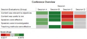
For example, this heat map makes it obvious that Session C was the least popular event in this conference – but notice also that the range of scores is fairly close together. In this example, attendees used a 5 point scale, with 1 being the least favorable score and 5 being the most favorable score. Seeing that the lowest average score was above 4 tells us that, overall, attendees were quite happy with this conference.

A heatmap showing how each individual session was rated along multiple criteria -- click on the picture to enlarge it
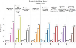
Of course we also want to understand what worked well and what didn’t work so well. Let us take a more detailed look at Session C.
Very quickly we can tell that the audience was critical of the session content and how it was presented rather than the speaker’s knowledge about the subject. More than 90% felt that the speaker had an adequate background to present on this topic. But less than 75% were happy with the way the information was presented and how it related to their job. A few people awarded low scores of 2 and 1, but it is encouraging that these low scores came from fewer than 10% of the audience members.
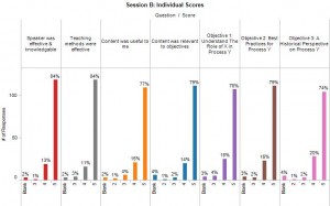
Just to provide a contrast, let’s also take a look at Session B, clearly the favorite of this event.
There is no doubt that the audience rated this Session very highly across the board: 74% or more audience members awarded it the highest score across all measures. Notice that this session, too, received a handful of low scores.
As we can see here, sometimes we only need a few pictures to gain useful insights. No doubt, if this were a more involved customer survey, we would need more and very likely different graphs to discern the finer points of attitudes and perceptions — especially when such information is tracked over time. But pictures like these are a good start to find out where to focus such additional efforts.


