Last week I wrote about the need to expand our visual vocabulary in line with software that allows us to graph complex data relationships and events in ever more meaningful ways. Let me expand on this point with an example.
Just about any introductory statistics course covers the draft lottery of the Vietnam War era as a case study for determining whether events occurred by chance or whether they were subject to some significant influence. Typically this case study involves a scatter plot and discussions about statistical significance, p-values and regression lines.
The section of the draft lottery we are discussing here involved the following process: Each Birthday was given a number from 1 to 366 (including leap day) so that 1 = Jan 1st, 2 = Jan 2nd, 3 = Jan 3rd and so on until 366 = Dec 31st. Each Birthday number was written on a piece of paper, put in a plastic capsule and then in a shoebox from which each was later drawn one at a time. The Draft Number represents the order in which each birthday was drawn from the shoebox.
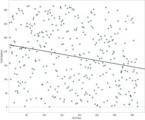
The scatter plot below shows Birthdays vs. Draft Numbers along with a trend line to indicate the relationship between the two. The casual observer may not notice the relative sparsity of data points in the upper right hand quadrant, let alone grasp the significance of it. It takes careful observation to notice that a significant number of birthdays that occur later in the year have lower draft numbers and visa versa.

Scatter plot and trend line showing Birthday vs. Draft Number. P < 0.0001 - Click the picture to enlarge it.
During business discussions or presentations we often do not have time to explain statistical models and their implications. Sometimes we need to find more intuitive means to get our point across quickly and effectively. When constructed properly, visual displays can convey a lot of information very quickly.
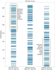
To illustrate the results from the Draft Lottery more intuitively, I divided all birthdays into three equal groups: Group 1 includes days 1 – 122, Group 2 includes days 123 to 244 and Group 3 includes days 245 to 366. I then plotted the corresponding draft numbers in each Birthday Group.
At a glance one can see that the Birthdays tend to cluster toward the upper end of the Draft Numbers range in Group 1 and toward the lower end of the Draft Numbers range in Group 3. There is no need to talk about p-values and regression lines, just a quick note pointing out that Birthdays in the early part of the year had a better chance of receiving a high draft number than Birthdays that occurred later in the year.
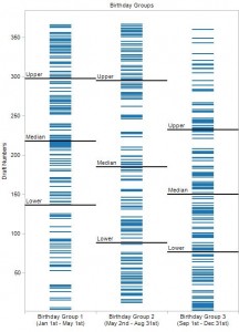
An alternative representation may include reference lines for quartiles as in this illustration:

Draft Numbers by Birthday Group - including reference lines for quartiles. Click the picture to enlarge it.
Business decisions, of course, are based on more than fancy pictures and we need to be able to back things up through detailed analysis. But when time is short and we need to make our point quickly, the second graph helps us out much more than the scatter plot.
Acknowledgements:
A big “Thank You” goes to the authors of “Online Statistics: An Interactive Multimedia Course of Study” for providing the data and for the inspiration to visualize it in a format other than a scatter plot. This free online course was developed at Rice University, University of Houston, Clear Lake, and University of Houston, Downtown, with partial support from the National Science Foundation.
All graphs were generated using Tableau software.


Dick,
thank you for the kind words – I feel honored. Yes, the books by Edward Tufte and Stephen Few have inspired many of us, including Yours Truly. Communicating with pictures, be they photographs or data graphs, can be very effective and I enjoy the creative aspect they entail.
Thanks for sharing this in the past few posts, Christine. Pretty cool. Reminds me of “Beautiful Evidence” and other works by Edward Tufte. I’m glad it’s becoming easier to communicate scientific data in more visual and intuitive ways – and I appreciate your insights on the process.