When we use analysis tools like Tableau software, it becomes very important to keep our bearings about the data we are investigating. For example, we need to keep in mind that Tableau retrieves and calculates information based only on the data needed to generate the graph. That statement sounds really, duh, obvious. But we can get into trouble when we don’t think about it 🙂
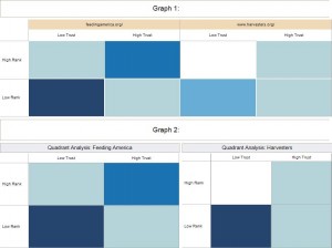
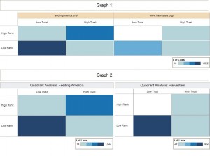
Let’s look at an example. Below are two graphs based on exactly the same underlying data – but why do the colors look different? Each graph appears to show a quadrant analysis that compares two web sites based on their search engine rank and trust.
The difference lies in the way each graph is generated: the first graph really represents a set of eight data points, while the second graph represents two sets of four data points each – a subtle, but important distinction. The second graph shows the quadrants for each individual site using a separate scale for each site. This allows us to compare each site quadrant by quadrant without having to worry about one site having vastly more links than the other. In other words, we can answer questions like: which site did a better job of getting high quality links vs. low quality links?
The first graph combines the data for both sites and plots each quadrant on a scale for the combined data. If one site has many more links than the other site, it will skew the scale toward the higher linked site. In essence, we are comparing all eight quadrants against each other as opposed to comparing how each site performed on a particular quadrant.
The second graph therefore is the “correct” quadrant analysis if we want to compare each site quadrant by quadrant. But why even talk about the first graph?
That’s because in Tableau it may be tempting to generate the first graph to save time – especially when one is new to Tableau. We only have to drag the “Site Name” dimension onto the column shelf and, voila, we can show both sites next to each other. The problem is this: the shading is now determined based on all 8 data points together – rather than using a set of 4 data points for each individual site. This becomes obvious once we add color scales to the graphs:
The first graph really does not compare the two sites to each other. Instead it takes a look at all the links for both sites combined and creates 8 data points from all those links. The second graph uses data from one site at a time. A small – but critical – difference.
While this example may seem trivial, it actually has deep implications when we deal with more complex visualizations. For example, when we use bins or when we filter records based on certain values, we may add misleading reference lines or create inaccurate charts – but that’s a topic for another day.


Good suggestion, Michael, and yes, that does make sense.
By the way, the most succinct summary of web site stats I’ve seen is a spider graph that compares two web sites across six dimensions. To get an overview, the numbers don’t matter as much as being able to tell how the two sites overlap. With the spider graph one can tell at a glance how the sites compare at the domain and URL level for Trust, Rank and external links.
SEOmoz (http://www.seomoz.org) does a nice job with that. Their spider graph very quickly communicates on which dimension(s) to focus SEO efforts. Here’s an example: http://www.screencast.com/users/glenncrocker/folders/Jing/media/67a1148d-3cc3-4a05-96ac-abbb6c27059e
Christine,
Your intended audience likely understands your use of color in this “game plan” quadrant analysis. This is something we do all the time, albeit not with web site analytics, and it quickly communicates. Since you are using a dashboard anyway for Graph 2, would there be any benefit to developing a legend table that shows the values appropriate to each class interval (color) for each of the sites? You could add this to the dashboard as well?
MANY BLESSINGS!
Peace and All Good!
Michael W Cristiani
Market Intelligence Group, LLC
Good question, Joe.
In this post I included the number scales to illustrate a point. For our purposes, the actual numbers don’t matter as much as seeing into which end of the number range each quadrant falls – hence I’m using only four shades of the same color. Dark blue denotes “lots of links” while light blue denotes “few links.” For each site we want to see which quadrant has “lots of links” and which quadrant has “few links.”
For example, seeing lots of links in the “Hi Trust, Hi Rank” quadrant means that we are looking at a site that is considered to be trustworthy and valuable by search engines. Doing this for each individual site allows us to see whether they are evaluated approximately the same or differently by search engines.
This is just a dashboard like overview to see at a glance what’s going on. We have other graphs that look at the data in more detail and break out the number of links differently.
From a viewpoint of not understanding the specific business logic behind your analysis, I think Graph 1 is less misleading. In Graph 2 you use the same color space to define two separate ranges of values. How does it help when the same color means two different things?