Ted Cuzzillo, the author behind the datadoodle blog, got me thinking about data details today. When do they matter and when do they distract from what matters?
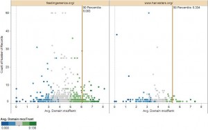
Being a data analyst means that I love details: the more the better, so I can understand how they form the Big Picture. Intrinsically, I am drawn to graphs like this one:

A scatter plot showing individual data points and 90th percentile reference lines with their respective values
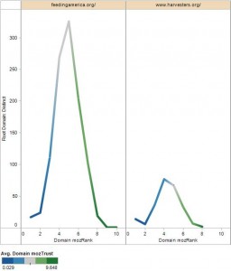
The spray of dots and their colors actually tell me something. They give me a feel for the data and point me toward what is driving the overall result. I can dig into individual data points and learn from them. On the other hand, many people need a more abstract view of the world – a view that boils down to the overall shape of things. After all, meaningful abstractions – like the graph below – are needed to make strategic, big picture decisions.
The graph above only plots 18 data points and connects them through a line to show the overall shape of the data. Of course, the more we abstract information, the more we loose the ability to derive meaningful insights.
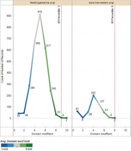
In order to generate this line graph, I had to create bins into which I could group the many data points from the first graph. This means I now only have 18 data points from which to differentiate between the bottom 90% and the top 10% of the data. In the graph below, the numbers along each line indicate the number of records that have been binned to create each data point. As we can see from the 90th percentile reference lines below, the bottom 90% of the handful of data points in each section fall below 9 and 8 respectively.
However, the very first graph in this story shows us just how misleading the percentiles from the abstracted data are. According to the more detailed data, the 90th percentile values come out to 6.083 and 5.334 respectively. The abstracted values point in the right direction, but they are quite bit removed from the true values. The more detail we use, the closer we get to the truth.


Thanks, Joe.
This is a good example to show why knowing more details about the data definitely helps. One would especially want to find out what could skew these results. Here are a few thoughts:
* how are “failure” and “malfunction” defined? I’m no hardware technician, but I have to believe that some “malfunctions” are minor glitches while others are major issues that render the machine unusable.
* not everyone fesses up to “accidental” damage or damage that results from operator error – especially during a warranty period. How did their study account for that?
* is the data based on computers that this company services? If so, then the previous point is even more important. Often it’s easier just to send the machine in and get a replacement over night than to figure out whether software or other non-hardware issues created the problem.
Yes, data details can be messy 🙂
Just saw this today: http://tumbledry.org/2009/11/20/when_information_overwhelms
Same situation you are describing. Representing lots of data as only a few data points makes the chart look simpler, but it can be deceiving.