For several years I have participated in the Heartland Association of Research Professionals (HARP), a non-profit organization that provides educational and networking opportunities for nearly 200 professionals engaged in clinical research and related fields.
Recently we surveyed current and prospective HARP members to gather feedback regarding the services we provide. This gave me a nice opportunity to learn more about Tableau. While I did encounter some formatting issues, Tableau provided a quick and easy way to explore survey results.
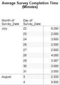
Quite useful was the ability to set up all the graphs, tables and dashboards while the survey data was being collected. Periodically I could update everything simply by refreshing the underlying data. This allowed me to easily keep my fellow board members in the loop while data was rolling in. It also allowed me to send reminders to survey participants using actual completion times to assure them that participation would really take only take a few minutes of their time.

Questions that allow for multiple answers can be a bit tricky to analyze, but visualizing the results with Tableau made that analysis much easier. The example here illustrates the various research certifications held by HARP members. This question focused on research certification as opposed to certification in other domains.

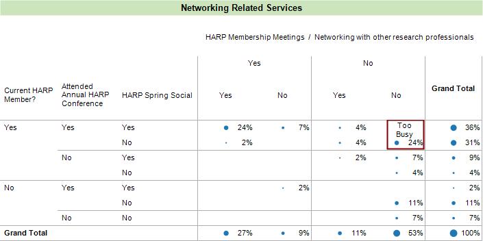
Below is an example using graphical clues and annotation to illustrate which of four networking related services were used by current and prospective HARP members. I cannot imagine anyone who would want to read a written description of these results. A picture communicates this much better and without the proverbial “thousand words.”

To improve readability, Tableau provides a great variety of formatting and labeling options such as turning titles, column and row headings on or off.
Example 1: Title turned on, Row Headings turned off:

Example 2: Title turned off, Row Headings turned on:

From a communications standpoint, it would have been nice if there had been a way to include all options of the five point scale in this graph. The fact that no one selected “Somewhat Unimportant” nor “Unimportant” would be much easier to see if I did not have to talk about it in a comment.
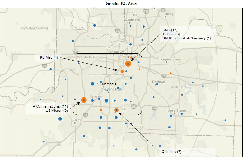
Using nothing more than zip codes as geographic coding data, Tableau provided us with a quick idea about the geographic dispersion of our membership – very handy, since picking a good meeting location is always a tricky topic.


Nice work.