Often we have to work with data without knowing all the details of how it was collected and processed. In those situations we first need to determine what information the data contains and what it can and cannot tell us. We need to ask questions of the data and determine whether it makes sense, given what we already know. To hone in on the time saving questions it helps to be a subject matter expert. But even if we are unfamiliar with the subject area, we can start by inspecting the different pieces of data to see how everything fits together. Visual analysis tools like Tableau software make that job much easier than it used to be.
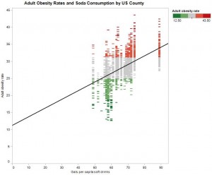
Here is an example of how such an exploration may look: we are exploring data about obesity, soda consumption and sales taxes on soda. We are told this data came from the US Department of Agriculture and a quick look reveals that we are looking at county level data. As one might expect, a scatter plot reveals a strong relationship between rising soda consumption and increased obesity.
Now we get to the real questions: do sales taxes on soda help with lowering obesity rates? What relationship do we see between sales tax rates on soda and obesity? As luck would have it, the data we received also provides two measures about sales taxes for soda: one rate for vending machines and another rate for retail stores.
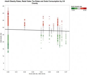
First we look at the relationship between soda taxes for retail stores versus obesity rates. One might expect that taxes discourage soda consumption and, yes, there appears to be a small downward trend as tax rates increase. Maybe soda taxes actually help with bringing down obesity?
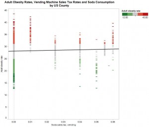
Now let’s take a look at sales taxes on soda coming from vending machines. Interesting observation: diabetes rates seem to increase slightly as these tax rates increase. Counter intuitive? How do vending machine purchases differ from purchases in a retail store? Are we observing a real relationship here, or is the data fooling us?
Before answering these questions, let’s take a closer look at all those data points on the y-axis. Do they really indicate that these counties levy a 0% soda tax? A quick inspection of the underlying data shows that, yes indeed, all records indicate a 0% tax rate. Not a single “null” value among them. However, without knowing how the data was processed, we cannot be sure that “zero” really means “no taxes” – it could also mean “no data.”
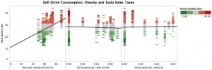
To explore further we start by placing the three graphs side by side. This way we can see more easily what happens when we exclude “zeroes.”
First we exclude “zeroes” for retail sales taxes. Then we’ll do the same with taxes levied on soda in vending machines. The following graphs illustrate this.
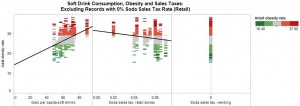
Excluding Records with 0% Soda Sales Tax Rate (Retail). The center graph shows the relationship between the remaining retail records and obesity. The trend line still points downward.
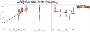
Excluding Records with 0% Soda Sales Tax Rate (Vending). The right hand graph shows the relationship between the remaining vending machine records and obesity. We now see a downward trend as tax rates increase.
Wait a minute, though. When we exclude “zeroes” from one set of taxes, all data points for “greater than 0% taxes” disappear from the other graph. In other words, this data indicates that the two types of taxes are mutually exclusive! Hmm, does this even make sense in real life? Why would every US county tax soda either in retail stores or in vending machines but never in both?
Without further knowledge about this data we have to reframe our questions and conclusions:
- When soda taxes are levied, higher tax rates appear to go hand in hand with decreasing obesity rates
- We cannot draw any conclusions about the impact of “no sales taxes” versus “sales taxes”
- Before we continue with a detailed analysis, we probably need to ask questions about this data. At first glance it makes little sense that counties levy soda taxes either on vending machines or on retail stores but never on both. Then again, I’m not a tax expert.
Chances are that we will uncover other areas about which we need to ask questions. Instead of taking the scattershot approach to learning about this data, data exploration helps us to develop very specific questions to ask. With specific questions, we stand a better chance of finding the right subject matter experts to consult.
This was a quick example for exploring data about which we knew nothing when we started. To gain new insights, we sometimes need to apply this “beginners mind” approach even to data about which we already know a lot. After all, errors can happen, collection and processing systems can change without our knowledge and sometimes we find nuggets that were hidden until we started looking for them. One final thought: the next time your boss or client asks to hurry up with the analysis, ask these two questions:
- What are the consequences of making poor decisions because we hurried too quickly through the data exploration?
- Do we need to go for more accuracy or is a ballpark analysis good enough at this time?

Jerome:
thank you for the comment and the link. I am glad to find someone who seems to be more familiar with this data set than I was before working with it. If you have some insight on the soda tax question, I would love to hear it. It seems strange that counties would have sales taxes for soda either in the retail store or in a vending machine but not in both. Any thoughts?
Christine, I am so happy to find someone who worked with that dataset and who explained their thought process. my take is here: http://www.jeromecukier.net/?p=355
Looking forward to read more on this subject on your blog
kind regards,
jerome
Andy:
Thank you for your note. The data that was available to me contains only a snapshot and no time series data – hence the caveat about drawing definitive conclusions from it. You are welcome to download the workbook – just scroll to the bottom of the graph in this post: http://pharma-bi.com/2010/03/beware-of-creative-analytics-lies-damned-lies-and-statistics/ and download it from there.
BTW, your post about public opinion and health care reform looks very interesting 🙂 IMHO, with complicated and far reaching legislation like Health Care Reform, hype and polarized political talk should be expected. It’s a good thing that we no longer live in a TV soundbite world and that we now have the internet to help us cut through the polarizing rhetoric.
Can you publish your Tableau Packaged Workbook? It’d like to explore the data myself. Most curiously, I’d like to look at the data across time.