Today’s shrinking resources may tempt us into rushing things along, yet we need to be careful when relying on graphics to make decisions. Good graphics make their point more quickly than a wall of text. On the other hand, poor graphics easily create the wrong impression. Distinguishing between the two is not as easy as one might think.
Data analysis tools have advanced to the point where seemingly anyone with basic computer skills can develop meaningful insights. As with any tool, however, operator skill determines the ultimate outcome. Anyone can create graphs with trend lines, but knowing how to graph data properly requires skill.
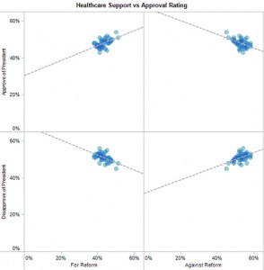
For example, the graphic below appeared in a recent blog post about the impact of Health Care Reform on President Obama’s popularity. While the trend lines look impressive, this graph misleads the reader.

Four scatter graphs contrasting public opinion about Obama with public opinion about Health Care Reform
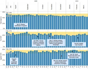
It is true that statisticians use scatter plots to show the relationship between two variables, but in this case a third variable plays an overriding role. This third variable is Time. Public opinions shift over time, depending on the headlines and the proposed changes in legislation. A scatter plot cannot take this into consideration. A timeline chart such as the one below proves to be more informative: it shows trends over time and provides possible explanations for shifts in public opinion.
Think about the many graphics we consume on a daily basis, whether in business meetings or in the media. What do we really know about the skill and motivation of the author behind the graphic? If a graphic supports an opinion we already hold, we may never question it – even if our opinion deserves questioning!
Herein lies the Catch-22: during times of change we have even less time than usual to deal with the intricacies of data analysis. Yet, precisely at those times do we need to question our assumptions, adapt to new realities and update our opinions. One way of solving this dilemma: delegate data analysis to people with the appropriate experience and skills.


Thanks, Andy, I feel much better now 🙂
Thanks Christine! I sure was hoping you didn’t intend to offend me. You’re forgiven. 🙂
I enjoy reading your blog. Keep up the good work!
Andy:
my sincere apologies for offending you and for omitting the link to your post. Neither a personal attack nor a critique of your skills and experience were intended. Your post described how you explored this data and mentioned that the scatter plots were not the best way. I added the “why,” included the comment that “… the graphic below appeared in a recent blog post …” and forgot to add the appropriate link.
By the way, my reasoning for using a bar chart rather than a trendline: the underlying data was a collection of responses to separate surveys. Since we have to assume that different people responded to each survey, I did not want to imply that the opinion of the same group of people has changed over time. Maybe over a virtual beer we can discuss whether I am splitting hairs and whether the samples were representative of the population 🙂
Sorry, one other thing. When you create a blog post that refers to a graphic that someone else created, you should link back to their post, not save the graphic as if it’s your own.
I see you used my scatter plot. I argued in my post that the scatter plat was not the best way to represent the data. I also then posted the time trends like you recommend as well. I like the comments you add to your chart, however, I would have used a line chart instead of a column chart. It makes the trend much easier to see.
Just a question, were you suggesting that I do not have the appropriate experience and skills? It sure comes off that way.