A while back, SEO guru Glenn Crocker and I were talking about how visual analytics can help with search engine optimization. Getting useful SEO information usually requires crunching data for thousands of links, so it’s quite useful to have something that takes us from a quick overview to the interesting details.
To illustrate how visual analytics can help with this, we decided to look at the web sites for two of our favorite charities: Feeding America, formerly known as Second Harvest, and an affiliated organization called the Harvesters Community Food Network in Kansas City.
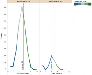
Using data from SEOmoz, we combined the links for both sites into one database and compared their link performance. A quick glance at the graph below tells us that Feeding America has the better SEO profile: more links in general and also more high quality links. This shouldn’t be too surprising since Feeding America is a national organization, while Harvesters serves the greater Kansas City area. But comparing the two sites provided some interesting data for us to review.
Two things are worth noting here:
- Some domains linking to Feeding America are very highly ranked – up to a rank of 10, while the domains linked to the Harvester’s site top out at 8. This is also reflected in the overall average for the domain ranks — 5.5 and 4.5 respectively.
- When looking at the color near the peak of each curve, we notice that the rank for domains with the most links to Feeding America is higher than for highly linked domains at Harvesters.

The quality of the links is indicated by the color (green is better) and the Domain mozRank (10 is best). The number of links is indicated by the height of each curve.
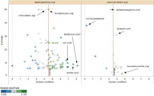
Next we tried to figure out which sites contributed the most to the SEO performance. Below I have highlighted a few of them. These scatter plots show domains that have 5 or more links across both sites. In the interactive version we can hover over data points to see more details about each domain. I am not sure that the folks at SEOmoz would be happy about me uploading their data, so I am showing just this picture to get the general idea across.
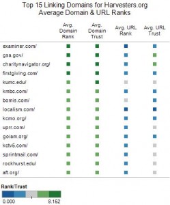
Depending on time and interest, we can perform even more fine grained analysis. For example, just because a highly ranked domain sends us links doesn’t mean the links rank equally well. The graph below shows that only two highly ranked domains send links of a similarly high rank.
Let’s pretend we are Harvesters and we want to reach an audience beyond the Kansas City area. By looking at these three graphs, we now know that
- we need more and better links
- we need web content that attracts more highly trusted domains
- we have plenty of links from the local community (many of the Top 15 Domains are from Kansas City based organizations). Maybe we should broaden our horizons and reach out to the owners of more nationally focused, highly trusted domains.
P.S.: Just in case anyone is curious: at least in the Kansas City area, Harvesters does rank at top for the search term “Harvesters”


